Product Design
B2C · Gaming
Philippines
0→1 to Scale
Redesigning TongitsHub's App Experience
How we revamped the core app interface to keep players engaged — successfully driving up retention and average session times.
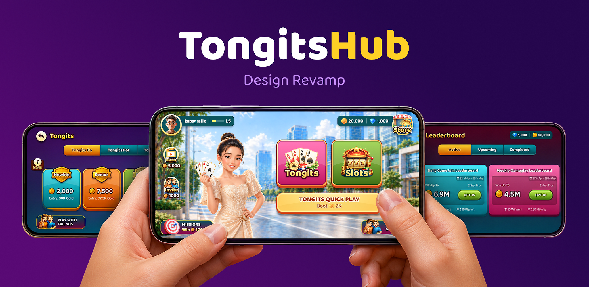
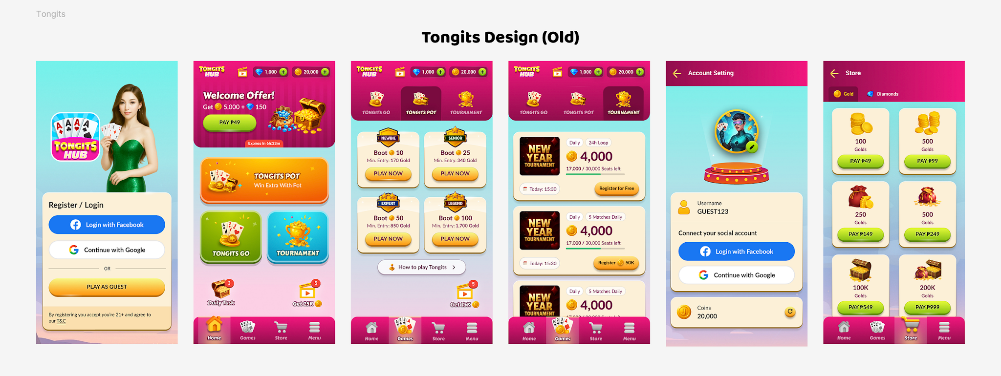
TongitsHub launched in November 2025 as an MVP to validate demand for a Tongits-focused, free-to-play gaming platform in the Philippines.
The Problem
The demand was clear: we acquired a healthy user base and proved the market hypothesis. But the next challenge was experience. Users were coming in, but not staying long enough. Retention and average session time were below the level needed to justify moving from MVP to a full-scale product investment.
My Read on the Problem
Before starting formal research, my working hypothesis as Design Head was that this was not a content or feature problem, but an experience-fit problem.
Users were not dropping off because Tongits was weak as a game; the format was already proven and loved. The issue was that the app experience — especially on opening — did not match what users had come to expect from years of using competitor Tongits apps.
So instead of jumping into quick fixes like faster loading, more bonuses, or small UI tweaks, I decided to commission proper research to validate this theory before investing design and engineering effort into a solution.
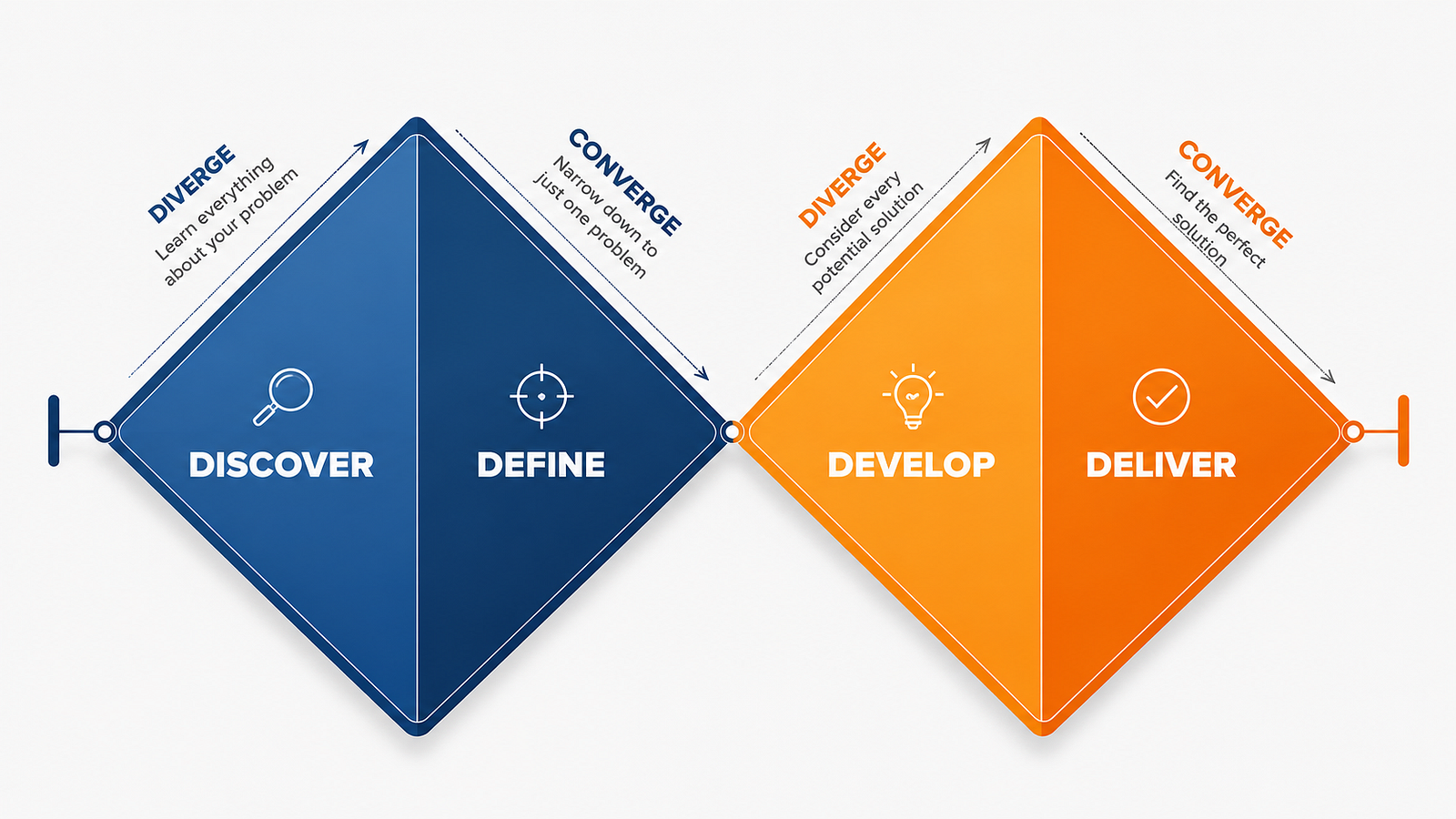
To structure the investigation, I led the project using the Double Diamond framework — Discover, Define, Develop, Deliver. Widen first to understand the real problem, then narrow to a single, well-justified solution.
How We Conducted the Investigation
1. Discover
As a design team, we built the research plan from the ground up and took a highly hands-on approach to the user interview calls. This wasn't a brief we simply handed off; our core team was directly in the room — or on the line — engaging with our users.
Track 1 — Qualitative User Research: What the Players Told Us
We conducted a qualitative study of 20 players across Metro Manila, Cavite, Bulacan, Cebu, and nearby provinces using direct user interviews and behavioral tracking. Instead of relying on dry, synthesized data, we jumped on the calls ourselves to hear the players' raw, unfiltered thoughts.
"I already know how to play Tongits on my phone."
Users already knew Tongits from competitor apps, so familiarity mattered more than reinvention.
"This is how I unwind after work."
Most play happened after work, for 30–45 minutes, so the experience needed to feel engaging and premium.
"If it looks shady, I'm out."
Users judged safety within seconds, making polish, clarity and visual quality critical.
"Make it feel like a game with friends, not a casino."
The tone needed to feel social, fun and community-led — not transactional or gambling-heavy.
Track 2 — Competitor Benchmarking
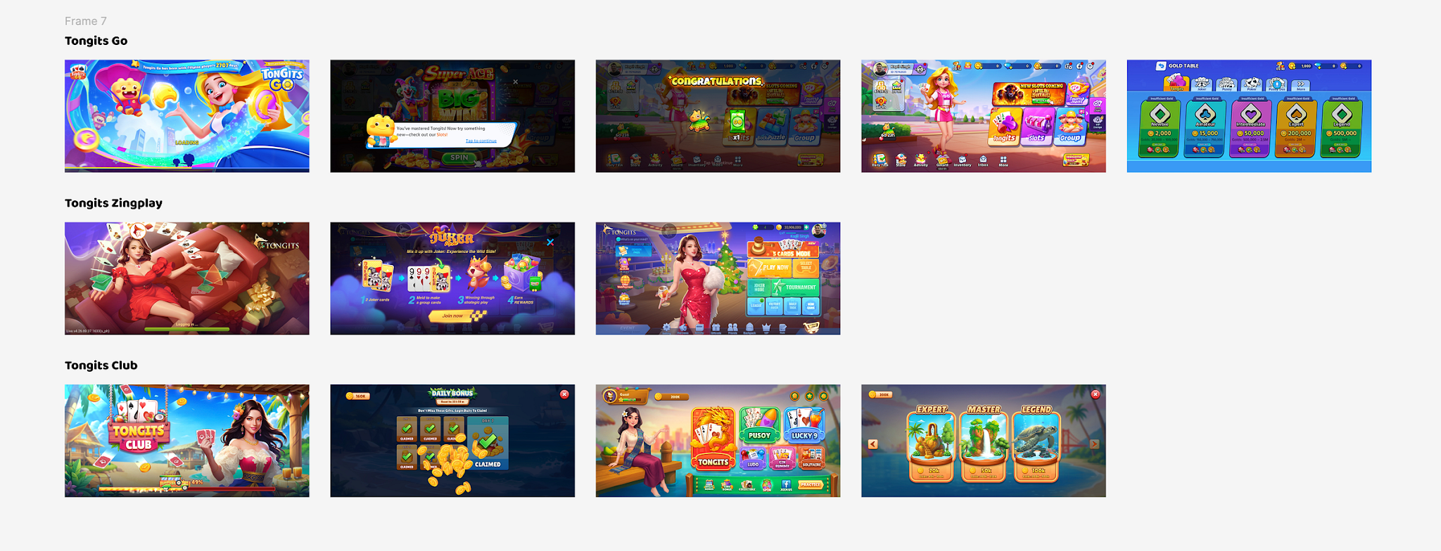
To understand the mental models our players already possessed, we conducted a targeted visual and UX audit of the most popular Tongits apps in the Philippine market — Tongits Go, ZingPlay Tongits and Tongits Club.
The finding was unambiguous: every major competitor was landscape-first. Not a majority — all of them. This told me the issue wasn't a matter of taste; it was a market standard that TongitsHub was failing to meet.
2. Define → Decision — The Call We Made
Our research surfaced a laundry list of possible issues — onboarding friction, trust signal gaps, layout problems, and aesthetic disconnects. But our job as a team wasn't just to collect findings; it was to prioritize the highest-leverage fixes.
We made the strategic call to tackle two foundational pillars simultaneously: fixing the homescreen orientation and drastically upgrading the visual richness. We needed to be at par with the competition and deliver exactly the immersive, vibrant experience our users expected.
Why we prioritized this dual-approach over smaller, isolated UI tweaks:
- Matching the mental model: It was the most universal pattern in the data. Every dominant competitor and user reference point highlighted the exact same gap in our layout and aesthetic. We had to meet their baseline expectations.
- Fixing the root cause, not symptoms: Trust signals, layout hierarchy, and character presence weren't separate problems. They were downstream consequences of getting the orientation and the visual richness right.
- Curing the "vibe check": Fixing the layout and injecting that vibrant, culturally resonant aesthetic directly addressed the underlying "this feels off" cognitive dissonance. We recognized that this gut reaction was the true, silent retention killer.
3. Develop — Leading the Design & Build
Once the direction was approved, I first translated the research findings into clear design principles before moving into execution.
The redesign was guided by two core principles:
Design for accessibility
Keep the experience familiar, easy to scan and simple to start playing.
Design for delight
Make the home screen feel rich, lively and rewarding from the first open.
We began with a card sorting exercise to identify what should appear on the home screen and how it should be prioritised. This helped us define the right hierarchy for game entry points, rewards, wallet actions, navigation and promotions.
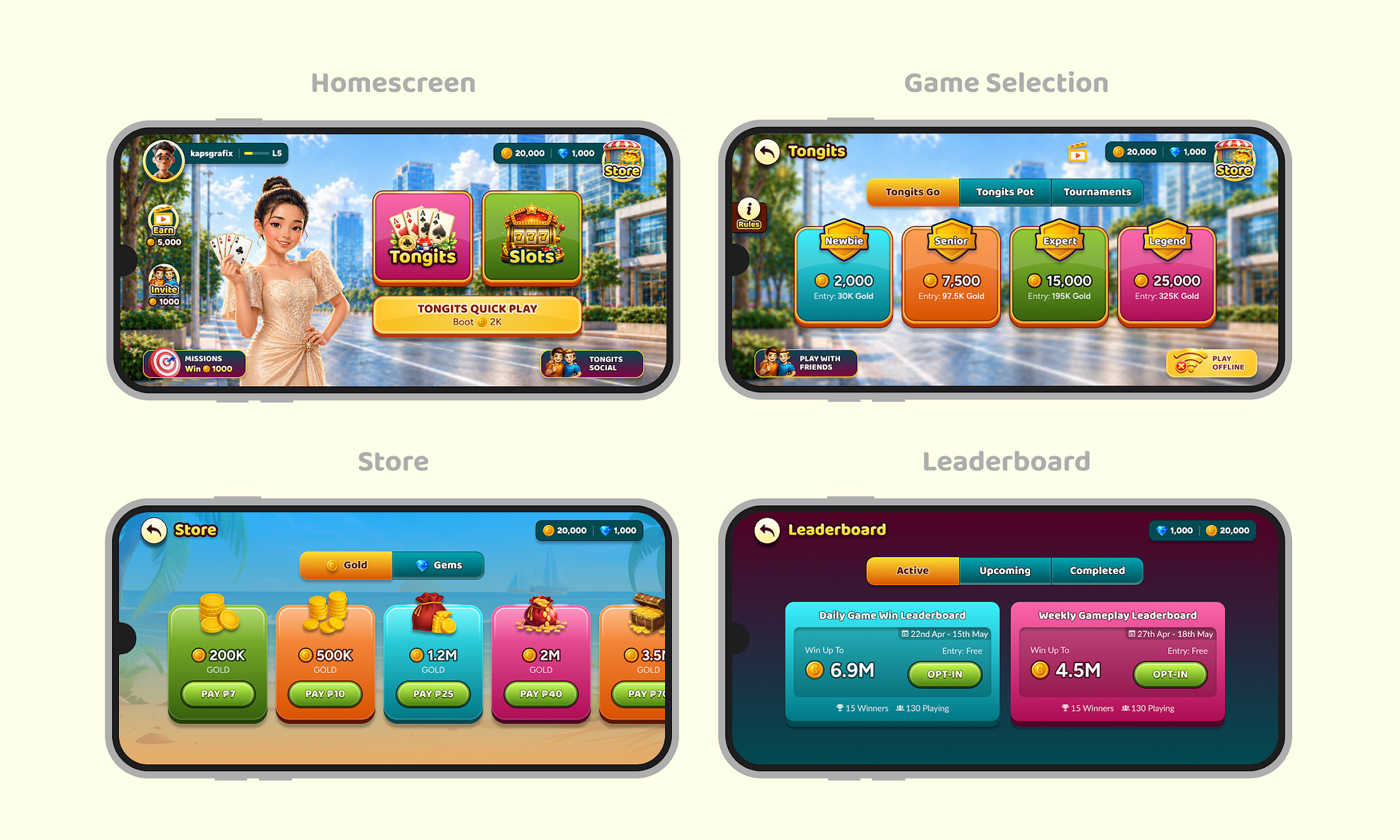
We then moved into wireframes to establish the landscape-first structure, followed by high-fidelity designs where we brought in richer visuals, stronger character presence, clear action zones and an engaging lobby experience.
My role through execution:
- Directed and reviewed my junior designer's wireframes and high-fidelity explorations against these principles.
- Collaborated with the dev team to validate technical feasibility of the landscape rebuild and sequence the engineering work.
- Collaborated with the motion graphics team to bring the character and ambient scene elements to life in a way that matched the energy benchmarked from competitors.
Final Designs
4. Deliver — Shipping It
Once the final designs were approved, we prepared the work for development handoff and made sure the engineering team had enough clarity to execute without ambiguity.
The Figma files were shared with the engineering lead, including final screens, user flows, interaction states, component behaviour, and key visual references. We also documented the core experience principles behind the redesign, so the build stayed aligned to the product intent and did not become just a screen-by-screen implementation exercise.
Since the redesign was a major shift from the MVP experience, we planned the release as a controlled experiment. The updated home screen was first rolled out to 10% of users, allowing us to validate the new direction, observe early behaviour, and reduce risk before considering a wider rollout.
The Outcome
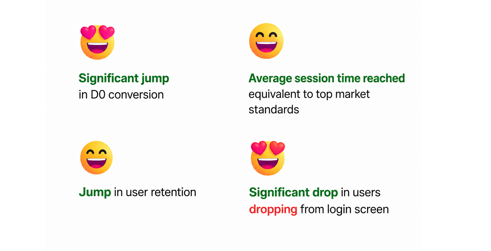
I would love to share the specifics, but data confidentiality guidelines prevent me from disclosing the exact figures. That said, I am pleased to report that the new flow performed exceptionally well — a clear signal that the landscape redesign successfully closed the experience-fit gap identified during research.
What This Taught Me as a Design Leader
- Research builds confidence, not just insights. Creating the research plan ourselves and speaking directly with users gave us the confidence to explain and defend the redesign. Hearing problems firsthand is far more convincing than relying on someone else's findings.
- Prioritization matters more than solutions. The biggest challenge wasn't designing a new homescreen — it was identifying the one problem that would have the greatest impact if solved. Good design starts with choosing the right problem.
- Industry patterns exist for a reason. When almost every competitor follows the same design pattern, it's usually because users expect it. Understanding those expectations helped us make informed decisions instead of chasing novelty.
- Great design is a team effort. The final experience came together because design, engineering, and motion design worked closely throughout the project. Leading the initiative meant aligning different teams around a shared goal, not just creating screens.